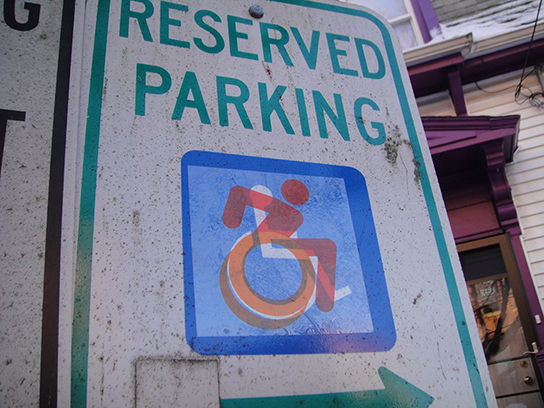
The
Accessible Icon
Project
The Accessible Icon Project is an ongoing work of design activism. It starts with a graphic icon, free for use in the public domain, and continues its work as a collaboration among people with disabilities and their allies toward a more accessible world.
An Icon is a Verb:
About the Project
by Sara Hendren, Feb. 2016
5 minute read — 910 words, 15 imagesHow do accessible cities thrive? And how would you “edit” an existing city to make it more inclusive? Brian Glenney and I were asking this question when we started altering public signs marking wheelchair-accessible parking—the blue and white icons designating the so-called “handicapped” spots.
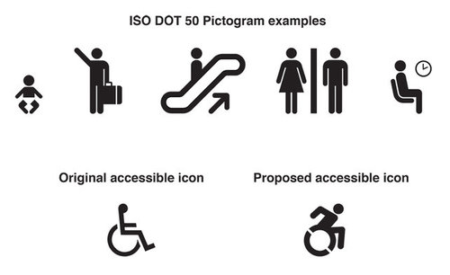
On my web site, Abler, I’d started collecting icons with more design integrity back in 2010. They were rare, but they were present—in high design places like museums, and at ordinary businesses, like my local Marshalls in Cambridge, Massachusetts.
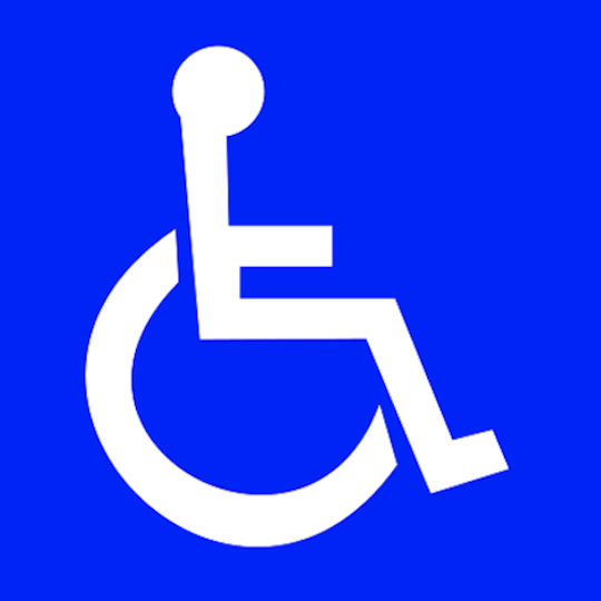
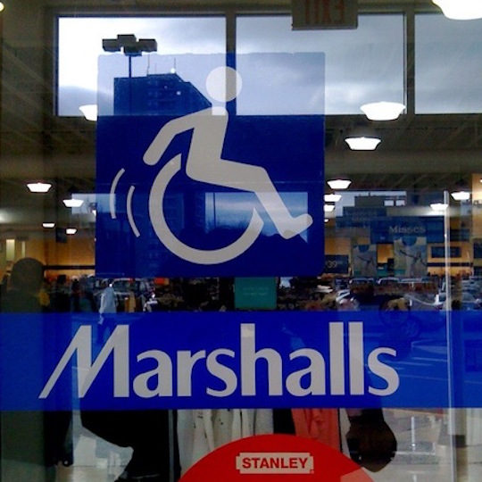
The difference between two icons like these was so striking to me that I couldn’t believe the second one (and others that are closely similar) wasn’t used more commonly.
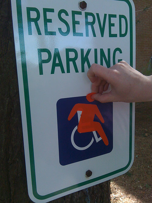
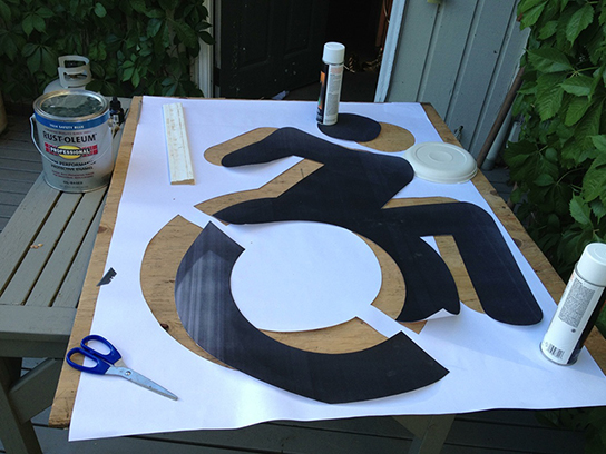
Brian and I had been collaborating on other projects at the same time, so he suggested that we do something to alter the existing signs. His own background in graffiti immediately brought to mind spray paint options, but we decided it would be better to mess around with decals or stickers. It started with experiments like this:
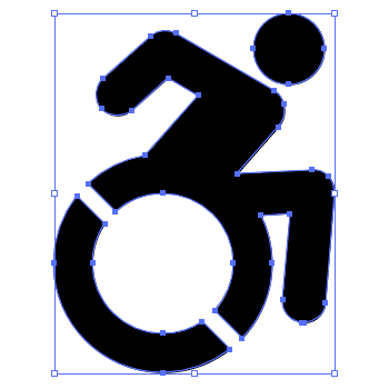
It ended up, in 2011, with a clear-backed square sticker - this one, that would be transposed right on top of the original, to show the old image and the new one simultaneously:
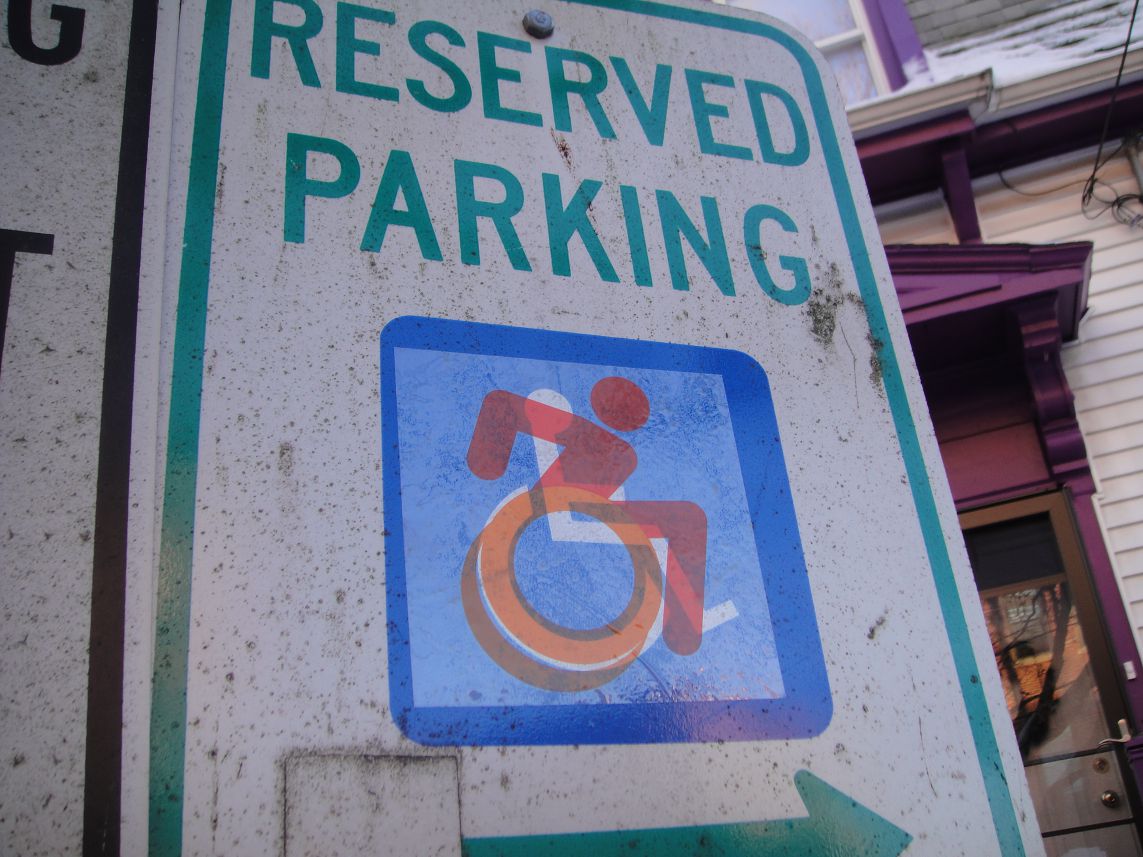
Applying these stickers around Boston started as a street art campaign—nothing more or less. We knew that editing the old signs as graffiti would pose questions more provocatively than a “better” icon, rendered professionally. And we knew that better icons already existed.
Instead, we wanted this icon-action to be the occasion for asking questions about disability and the built environment, in the largest sense. Who has access—physically, yes, but moreover, to education, to meaningful citizenship, to political rights? Framing this work as a street art campaign allowed it to live as a question, rather than a resolved proposition. At least at the outset.
Since 2011, we’ve gotten some press coverage for the work, and that coverage has brought us into conversation with people all over the world who are advocating for disability rights in many forms, in quite different contexts from the city of Boston.
Making those connections has outpaced our expectations for this work by a hundredfold. Those newfound collaborators have also told us that they wanted a new formal icon to replace the old ones, not just a street art design. So the project grew from guerilla activism to a social design project: The Accessible Icon Project. We partnered with Tim Ferguson Sauder, a professional graphic designer, to bring our icon in line with professional standards.
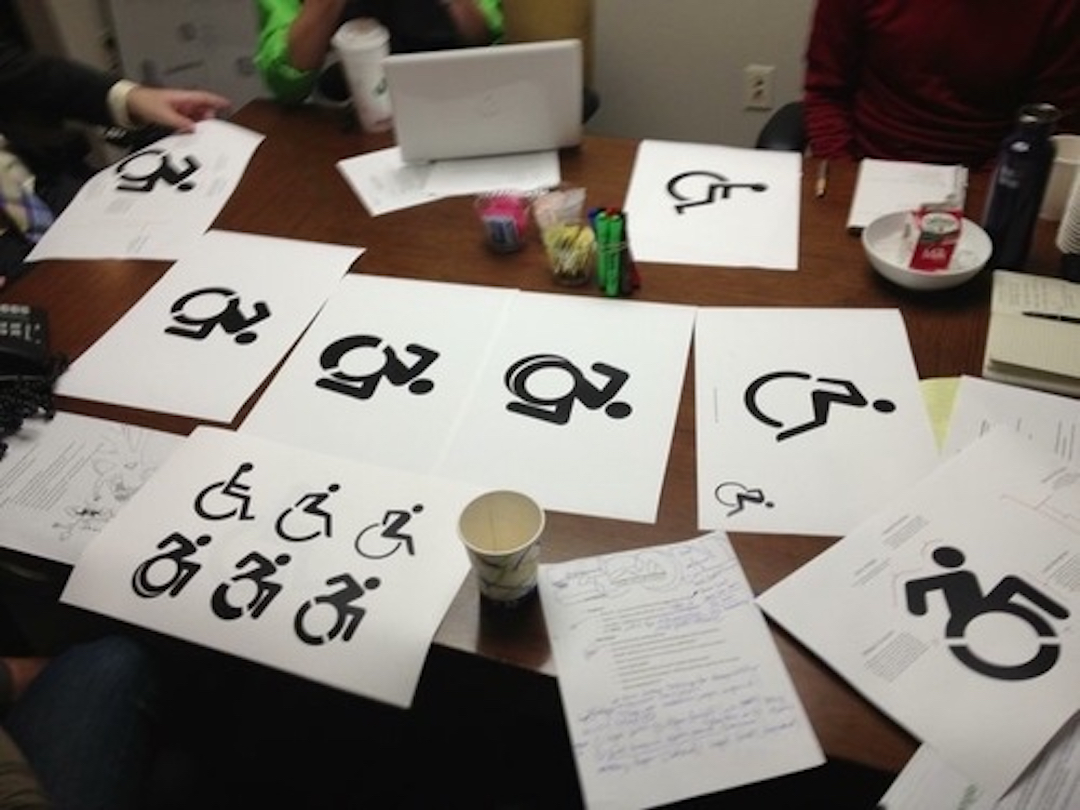
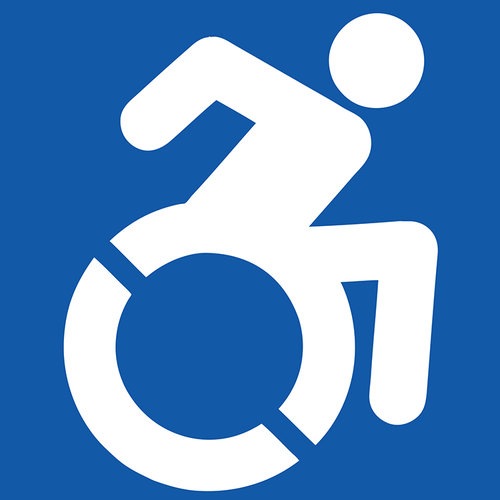
And we put it in the public domain, so we’ve never made any money on it. It’s an image that’s free for appropriation.
At the same time, we were approached by Triangle, Inc, in our own town of Boston, with an idea. Why not partner to create some events, where changing over the signs, if they were old and needed updating anyway? We loved this idea, and we’ve loved watching EPIC, Triangle’s community service organization that’s staffed by young adults with disabilities, lead the way in this effort. The events really aren’t about the graphics. They’re about disability in public space: editing the cities that we have, and signaling collective action for a more inclusive future.
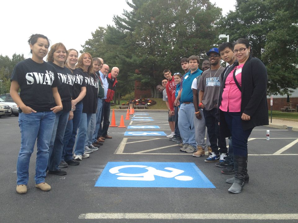
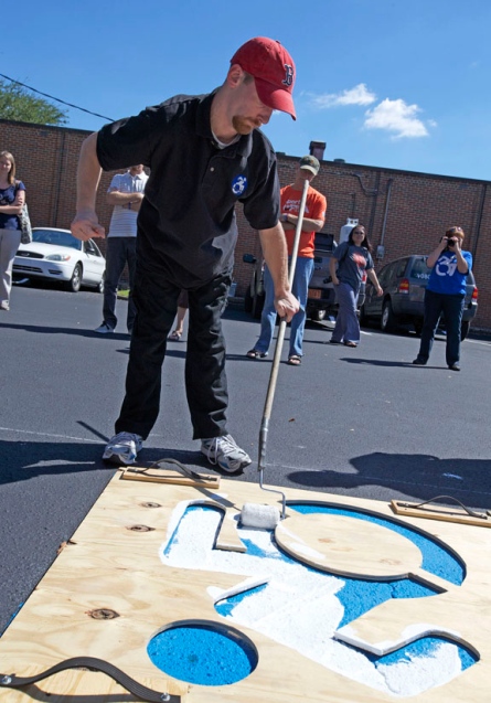
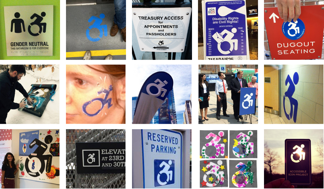
Since the start of the work in 2010, we’ve started seeing our icon in hundreds of different iterations and contexts—some edited versions, and some replaced wholesale with the new one. The project doesn’t belong to us now. It’s way beyond what we originally authored, and we’re glad. Most importantly for us, we’ve seen the icon become a kind of megaphone for our partners and friends who are self-advocates with disabilities: not just wheelchair users, but people who see this image as a metaphor, as a symbol of their own wishes for agency and dimensional action in the world.
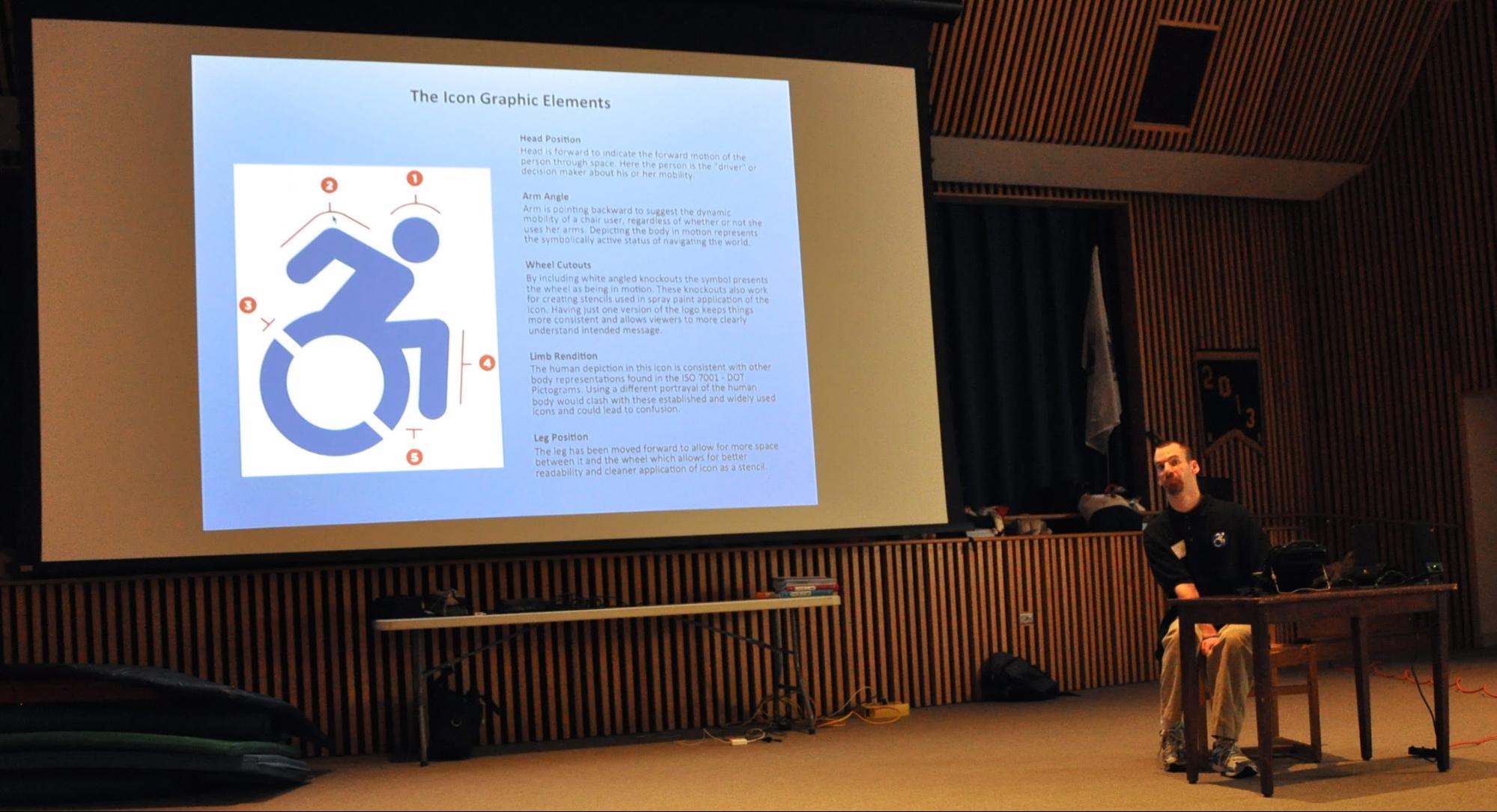
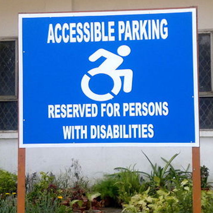
The icon is genuinely global now: in hundreds of cities and towns, at private and public organizations, used by governments and by individual citizens. We never, not in a million years, would have anticipated its growth when we first started.
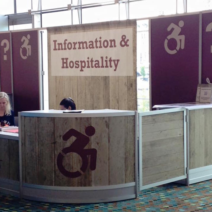
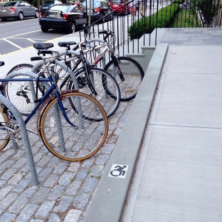
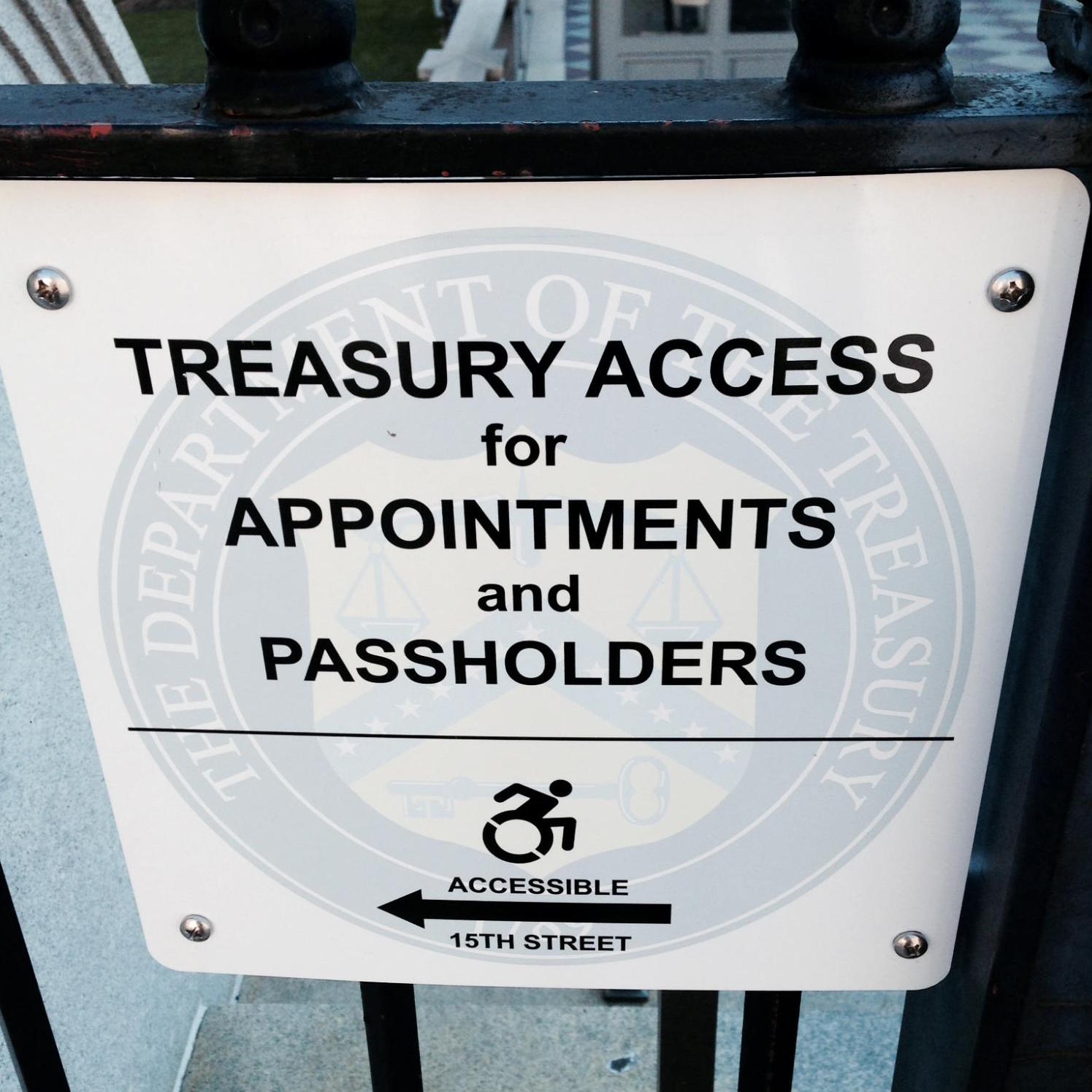
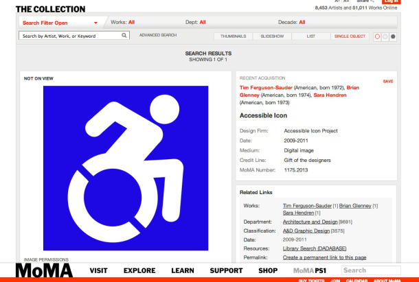
And we couldn’t have dreamed that MoMA would accession the work for its permanent collection.
Social media is now the place where people send the project their stories. You can download a free file here; watch the project on Facebook, Twitter, and Instagram; or contact us.
Notes on Design Activism
by Sara Hendren, 2015
6 minute read, 1515 wordsWhat is design activism?
Design activism uses the language of design to create political debate. Instead of solving problems in the manner of industrial design, or organizing forms as in graphic design, activist design creates a series of questions or proposals using artifacts or media for unresolved ends: to provoke, or question, or experiment in search of new political conditions. The point of these artifacts is contestation, not a tidy fix.
We’re inspired by design activism like ACTUP, Kissing Doesn’t Kill, or any number of historical street art political campaigns.
Why do you think of this project as activism?
It’s easy to look at our icon and assume that it’s a graphic design project. We get a lot of questions about the features of the icon itself and why ours is “better” than any other. But the graphic is actually a very small fraction of the work. As we’ve said from the beginning, the icon has been informally redesigned many times. We weren’t the first to change it. Our project began precisely by noticing the differences among icons already in existence.
Our project is an activist work because we started as a street art campaign, knowing that the mildly transgressive action of altering public property would engage potential media coverage about the legal status of graffiti. We used that media interest in graffiti’s legality to then shape our interviews to our own agenda: the politics of disability, access, and inclusion. Like the artist/activist collective WochenKlausur, we’ve noticed that the most deserving “social goods” stories don’t get nearly the same press coverage as cultural projects (especially where audiences can debate the “cultural” merits of a work!). Disability is subject to the same political invisibility and echo chambers as that of other minority groups, and too much direct activist work around disability is targeted toward people who already think disability rights are important. We wanted ideas about disability to reach a wider public, to be a matter of debate that’s harder to ignore. And in the most successful cases, we got journalists to talk to self-advocates with disabilities who rarely get a microphone for their wishes.
The design of the first graphic itself was also activist in nature—not a new “solution,” at least at the beginning. We debated long and hard about what the icon should look like for the first street sign campaign, and we eventually arrived at the clear-back version, which shows both the old and new icons at once. We knew that it wouldn’t be enough to make a change to a “better” icon. Instead, we wanted to have a graphic that was an enigma, or a question. Sustaining that question—in the form of collaborations, events, writing, exhibitions, and more—has been the activist heartbeat of the project.
Well—? Is it street art? Or is it design?
It’s both. We started as a street art campaign, and that phase of the work is what got us on the radar of likeminded advocates. But eventually people started asking us for a formal new icon, one that would replace old icons wholesale and be a public signal about an organization/school/company’s wish to be inclusive in its practices. That’s why Tim Ferguson-Sauder brought our icon in line with other formal infrastructural symbols you’ll see in public spaces everywhere. Our design is in the public domain, so now it’s used far and wide, in places we’ve never seen or heard about.
When we talk about this work, we’re transparent about the fact that a single project can span a continuum between a new artifact and a new set of conditions. Between ordinary graphic design and design activism. Letting the work live along that continuum allows it to be both an ongoing, long-term activist work and a free artifact that’s useful for simple graphics.
Not everyone is a wheelchair athlete. What about people who don’t push their chairs with their own arms?
Right. We’ve talked about this at length in all of our interviews, and it almost never gets included in the final cut. The arm pushing a chair is symbolic—as all icons are symbols, not literal representations. Our symbol speaks to the general primacy of personhood, and to the notion that the person first decides how and why s/he will navigate the world, in the broadest literal and metaphorical terms. To us, this evokes the disability rights mantra that demands “nothing about us without us.”
I identify as disabled, but I don’t use a chair. Why should that symbol speak for all kinds of accessibility?
It’s certainly an interesting question to consider how other symbols might stand in for or supplement the International Symbol of Access. We’ve spoken to designers about taking up that challenge as a thought project.
But consider the importance of a highly standardized and internationally recognizable symbol. It guarantees that its use will signal the availability of similar accommodations wherever it appears, and its reliable color combination and scale make it easy to spot on a crowded city street, or in an airport. Icons are standardized, 2D, and high contrast for a reason: to make them readily visible to anyone, anywhere. There’s power in that.
It’s just an image. Isn’t this just political correctness? Or: shouldn’t you be using your efforts on something more worthwhile, like real change?
We get this question a lot. And we’re certainly sensitive to one of the pitfalls of design work: an excessive emphasis on the way things look, without attention to other material conditions. From the project’s beginning, we’ve been interested in political and cultural change in the way disability is understood by multiple publics. And we’re aware that many people have been agitating for disability rights through direct activism for many decades.
We see this work as a counterpart to that history of direct action. And we think that symbolic activism—creative practices that are also political—do a work that can be hard to quantify but that also makes a difference. History shows that the shape and form of what we see and hear does work on our cognitive understanding of the world, and hence the meaning we make of it. For good and for ill, governments and institutions and protestors and dictators and individual citizens have long been using the language of symbols to persuade, to question, to force. We want to be on the bottom-up, rights-expanding, power-re-balancing tradition of that history.
So what’s the goal here? Universal sign change?
We’re happy when people write to us that their town or city wants to formally adopt the icon, and from news that politicians officially endorse its use. But success for us isn’t really located in the ubiquity of the icon itself. We want to see the icon stand for funding, rights provisions and guarantees, policies, and overall better conditions for people with disabilities. And we want this web site to track and document the progress of those harder goals.
Don’t you worry that this will be shallow activism, like “sign-washing”?
Sure. This is a big worry for us. Our icon is in the public domain, and that status is important to us. So we can’t really control when it gets used as a shallow glad-handing exercise that has no real political traction. But we’re trying, with this site and the way we speak elsewhere about the work, to emphasize the substantive efforts of people who don’t make the news as easily as a shiny new symbol.
Do you identify as disabled? Are you an ally? Does it matter?
We’ve always had people on our team who identify as disabled, and others of us who are immediate family members or direct co-workers of people who identify as disabled. It matters, of course, that we do this work and any work in disability as a “nothing about us without us” effort. Having said that: allyship also matters, and this project should be seen as one among many efforts to make new connections among new audiences who’ve seen disability as ignorable or irrelevant. We know from experience that we need much, much larger cultural conversations about disability to happen, including among people whose lives disability has not yet politicized.
Wow, you’re opinionated. Anything else you want to say?
A wise adviser told us, some years into this project, that any effort to create new and different forms of access will necessarily close off access of other kinds. We know that a wheelchair icon doesn’t stand for all kinds of ability. We know that our icon is being used in ways we don’t fully endorse. We know that this project’s birth in the US conditions our understanding in a way that’s culturally limited. And we know that we can’t control the journalistic treatment of this story. But the overwhelmingly positive response we’ve gotten from those of you who’ve reached out to us in the last five years is evidence that you see something in this work that you recognize. We hope that’s true for another five and beyond.
Contribute
Use the icon
In addition to the downloadable formats, above, the icon is available in webfont format as part of Font Awesome's Accessibility Icons collection.
Buy stickers and stencils
The Accessible Icon Project is operated by people with disabilities and their allies and is a partnership run in Boston at Triangle, Inc., a non-profit education and employment center for adults with disabilities. The icon has always been free for use in the public domain. Purchase proceeds from stickers and supplies go entirely to support the work of Triangle.

$3
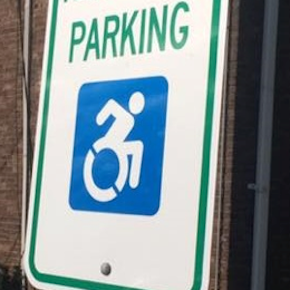
Square Sticker
7" in. x 7" in.
Covers standard parking signs
$8
Reflective Sticker
7.5" in. x 7.5" in.
Covers standard parking signs
$10
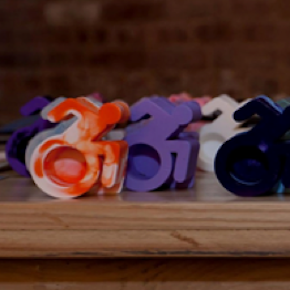
Figurines
Plastic figurines that are approx. 2.75 inches in height and vary in width as well as in color
$275
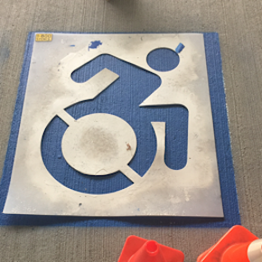
Parking Stencil
Covers standard pavement parking sign
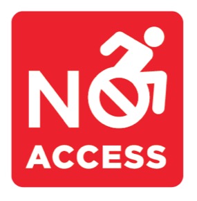
$5
"No Access" Sticker
Includes 20 stickers. 2" in. x 2" in. Help bring awareness of inaccessible spaces to your community
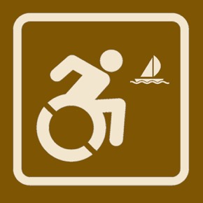
$25
Accessible Boating Sign
8" in. x 8" in. Brown recreation sign to indicate accessible boating

$25
Accessible Camping Sign
8" in. x 8" in. Brown recreation sign to indicate accessible camping

$25
Accessible Picnicking Sign
8" in. x 8" in. Brown recreation sign to indicate accessible picnicking
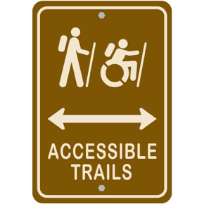
$30
Accessible Trails Sign
12" in. x 18" in. Brown recreation sign to indicate accessible trails. Please indicate arrow direction: "Left," "Right," "Both"
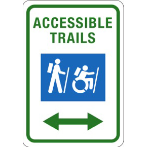
$30
Accessible Trails Sign
12" in. x 18" in. White recreation sign to indicate accessible trails. Please indicate arrow direction: "Left," "Right," "Both"
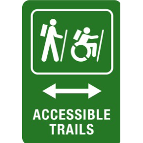
$30
Accessible Trails Sign
12" in. x 18" in. Green recreation sign to indicate accessible trails. Please indicate arrow direction: "Left," "Right," "Both"
Support Triangle
Triangle was founded in 1971 by a small group of individuals who believed that people with disabilities could learn to lead more independent and dignified lives. It began serving five people with developmental disabilities and grew over the next decade to provide employment training for over 80 individuals and opened two community residences in Malden.
Today Triangle serves over 3,000 people from 170 communities throughout Southern New England. It operates six employment service centers and ten residences in Malden, Danvers, Beverly, Braintree, Brockton, Lynn, Reading and Waltham. Their services are described in detail through Triangle’s homepage. They include an award-winning School-to-Career program for young adults with disabilities, comprehensive employment training and planning services for individuals with disabilities, an award-winning television show called Ablevision, a medical manufacturing facility, a contract fulfillment center and café that is staffed by trainees.
Support the work!Info
Contact
Questions? Stories? We’d love to hear from you!
Team
Sara Hendren, Brian Glenney, Tim Ferguson-Sauder, Jeff Gentry, Leah Serao, Jeff Lafata, Brendon Hildreth, Cyndi McMahon, Kim Izar, Keith Jones, Crystal Evans-Pradhan, Finn Bullers, Hector del Valle, Travis Talbot, Tim Lindgren, William Lu, Annabel Consilvio, Aaron Greiner, Triangle, Inc., the home of EPIC.
Press
- “New ‘Handicapped’ Symbol Featured At Museum of Modern Art,” disabilityscoop, March 6, 2014.
- “The wheelchair icon gets a makeover and museum fame,” Love That Max, February 20, 2014.
- “Does the International Wheelchair Symbol Need a Redesign?” Slate, February 19, 2014.
- “Icon For Access,” 99% Invisible, February 18, 2014.
- “Moving Forward Pop-Up,” Art Nerd New York, February 14, 2014.
- “The Accessible Icon Project,” The Navigator, January 23, 2014.
- “The Accessible Icon Project’s New Way to Re-Make a Traditional Symbol,” Minutes for Memories, December 22, 2013.
- “In motion: Accessible Icon Project moves forward,” Scope, December 17, 2013.
- “Disability Icon Revamped By Guerilla Art Project,” Page One of The Boston Globe, December 14, 2013.
- “Iconic Symbol Gets Moving in Makeover,” CNN, December 2, 2013.
- “City of New Bern Supports Accessible Icon Project,” Colleen Roberts, Oct 17, 2013.
- “New Handicapped Sign Rolls Into New York City,” NPR, July 07, 2013.
- “The Accessible Icon Project,” YAIlabs, June 28, 2013.
- “The Accessible Icon Project Revamps Famous Isotype,” Printmag, June 6, 2013.
- “How A Guerrilla Art Project Gave Birth To NYC’s New Wheelchair Symbol,” Fast Company, June 6, 2013.
- “Handicapped’ Symbol Gets Facelift,” disabilityscoop, June 28, 2013.
- “A Team of Academics Redesigns an Icon,” The Chronicle of Higher Education, June 20, 2013.
- “New York City planning to use a new, more progressive handicapped symbol,” The Verge, June 25, 2013.
- “More Powerful Than Words,” The Huffington Post, December 17, 2012.
- “Why Do Symbols Matter?,” Disability.gov, November 26, 2012.
- “Taking control: Redefining disability,” WCVB, October 20, 2012.
- “Gordon College adds new ‘accessibility icon’,” Salem News, October 20, 2012.
- “Malden unveils new statewide handicapped accessible parking sign,” WIcked Local, August 17, 2012.
- “Triangle Inc. Gets a Makeover,” Ablevision, August 16, 2012.
- “Enabling a New Icon,” The Boston Globe, February 21, 2011.
Social media
Facebook
Twitter
Instagram